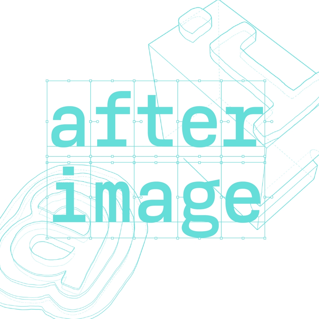
Afterimage
when drawing digital letters for fonts, the bounding shapes are rectangular boxes. but why? while this might make sense from a point of view of printing tradition, afterimage is inviting visitors to draw their own shapes that wrap the letters in their perception. offering the possibility to question the fundamentals of how visible language is stored on computers, starting with the shape of the smallest sequence: letters. afterimage aims at that: understanding the concept of letter shapes as perceived by a multitude of individuals.
simon thiefes works as designer, typographer, and educator. he teaches type design and digital toolmaking at haw hamburg, developing open source tool based approaches together with the students. he works on projects including wayfinding, websites, printed matter, and multimediaprojects. he often collaborates with joshua haymann under the umbrella of haymann thiefes studio.
joshua haymann is a paris-based freelance designer and educator. his work balances illustration and animation, typographic and systematic design projects. these include books, websites, and film titles for a variety of clients: architects, art publishers, film makers, and tech companies. he teaches design in a community high school in the suburbs of paris. together with simon thiefes, a fellow type design graduate at reading, he founded haymann thiefes studio.
